A Guide on How to Read Forex Charts
The method of predicting price changes in any forex currency pair is both a science and a skill. The process itself is scientific: utilising existing data and analysing information and results. However, the way these results are applied to a trade is based on the judgement of the individual.
Learning how to properly use forex charts is, therefore, a skill that every forex trader should aim to possess.
What are the three main charts?
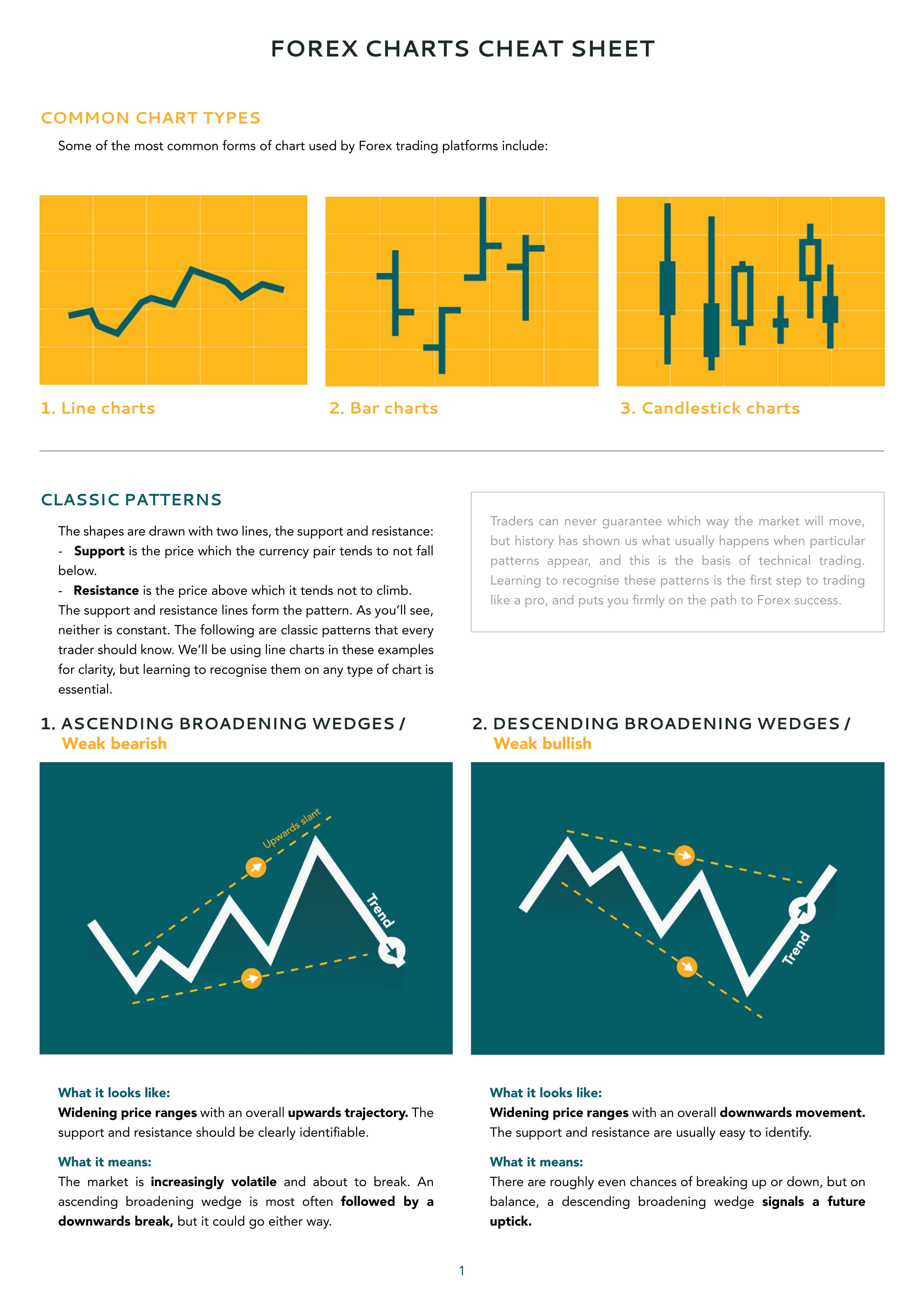
The values of a currency pair can be plotted on a chart to provide a quick, graphical representation of price moves. The form of this graphical representation may take on one of any number of appearances. Some of the most common charts used by forex trading platforms include:
Line charts
Line charts are produced by plotting the closing price positions at regular intervals over a set duration. These closing prices are then connected with straight lines. Favoured for their clarity, line charts are among the most commonly used by analysts to spot trends and predict prices.
Bar charts
Bar charts provide somewhat more data than a line graph: they include the opening and closing price, as well as its high and low price range within the set time period.
Bar charts are comprised of a series of vertical lines, with notches to the right and left side. The highest point of the vertical line records the high price during the period; the bottom of the vertical line logs the lowest price. The notch on the left-hand side of the vertical represents the opening price; the notch to the right, the closing price.
Bar charts on computer screens are often colour-coded. When the closing price is above the opening price, that period may be shaded black, or green. When the closing price falls below the opening price, it will usually be shaded red.
Candlestick charts
Candlestick charts appear superficially similar to bar graphs, and they record the same set of data.
A candlestick chart will have the appearance of a series of vertical rectangles, each with a vertical line running through its centre.
The height of the rectangle represents the difference between the opening and closing prices. The vertical line represents the highest and lowest price within the trading period.
Colour coding is important on a candlestick chart. In a period where the value closes higher than its opening price, the rectangle is coloured white, or clear (or green); when the closing price is below that of the opening value, the “candlestick” will be coloured red (or sometimes black).
Point and Figure charts
Point and figure (P&F) charts consist of a series of columns filled with Xs and Os, where an X represents a rise in price, and an O represents a fall in value.
Unlike the other chart forms described here, the x axis of a P&F chart is not representative of time. Only price change data is recorded on a P&F chart so, if no fluctuations in value occur, no new data is plotted on the chart.
The removal of the time-specific metric on a point and figure chart makes it a clearer and more concise option for analysing long term investments.
Data analysis is a scientific approach that helps us to make the right decision when using chart information that – at first glance – can often seem entirely random in appearance. We can begin to take positions with the confidence of knowing not only the statistically most probable breakout direction but also the market position which other informed traders will be most likely to adopt. Coupled with knowledge of price movements, this forms the foundation for every forex trader, young and old.
Written by Rob Bonnass